Mexican whisky and gin are on the rise, as are craft liqueurs, and with these growing categories a wave of creative designers are making their mark.
The last time I wrote about labels, I focused on mezcal. But today let’s cast our eyes to the larger world of Mexican craft spirits, where we’re seeing exciting innovation–from agave-based gin to corn-based liqueur. As a fan of thoughtful design, I’m pleased to see that a number of these brands are applying the same degree of creativity and care to their branding.
Solferino Gin
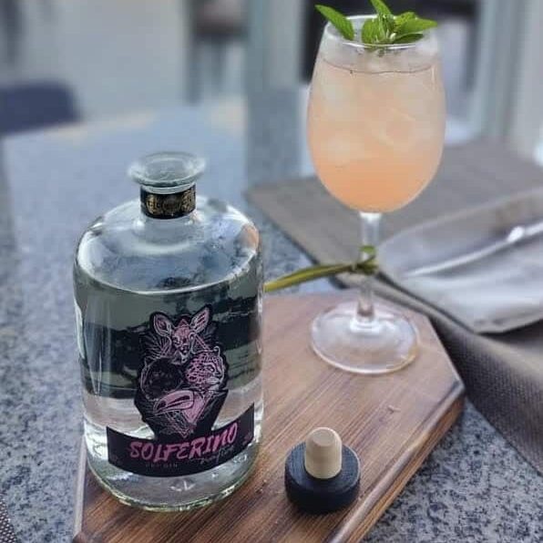
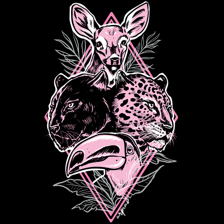
This Mexican gin stands out on the shelf with a rosette of iconic Yucatecan animals: a deer, a toucan, a jaguar, and a black jaguar. The pink and black label has a splashy 80s vibe that feels like the polar opposite of the botanical old-timey look favored by many craft spirits brands. No shade to old-timey whatsoever, but this is a fun change of pace and the graphic is striking and memorable. And, as with a lot of excellent branding, it represent an interesting story.
The Yucatecan gin is named for the town of Solferino, in the state of Quinana Roo, where its Argentinian founder found refuge during the pandemic. Solferino was once called Lac Kab, which means “old town” in Mayan. The invading Spanish began logging the surrounding jungle for the palo de tinte trees (also known as Mexican logwood), which have a deep red heartwood that was a valuable* source of dye. As the Spaniards piled the logs around the town, a rainstorm hit and the streets ran with pink water. The town name was changed to Solferino, which means “reddish-purple,” and pink became the town color.
Founder Christian Taraborrelli appreciated Solferino for welcoming him during a hard time and knew he wanted to pay homage. But as he puts it, “I didn’t know how to draw two straight lines.” To his good fortune, he met two talented traveling Argentinean tattoo artists, China Furlan and Noe Alba, who deftly translated his concepts into the perfect logo: fun yet surprisingly meaningful. The town’s color highlights the region’s sacred animals.
More on Solferino in this deep dive into Mexican gin by Leigh Thelmadatter.
*So valuable in fact that conflict surrounding the wood spawned a population of pirates.
Gracias a Dios Agave Gin

Gracias a Dios delivers a well-thought iteration of the old-timey genre. This label manages to be both intricate and bold, an impressive feat. The graphic designer demonstrates exactly how color choice can transform the same pattern. Gracias a Dios has a line of three gins: an Old Tom, Gin 32 (featuring 32 botanicals to represent Mexico’s 32 states), and Oaxaca Recipe, a gin that highlights eight botanicals from the brand’s home state. While the three expressions essentially have the same label, different color palates transform the visual experience. The Oaxaca Recipe label is richly saturated in teal and tangerine, while 32 Botanicals is more delicate, with cream, teal, and yellow.
Revés Mexican Whisky


The Mexican whisky landscape is becoming downright crowded, and smart brands are looking for ways to stand out. Revés does so with a label that’s atypical for Mexican whisky, but manages to be original without seeming try-hard. The intricate yet understated design works equally well in the brand’s various colored labels: blue, red, and black.
Valdeflores Rum

We love to see branding than showcase artwork that could stand on its own. Valdeflores Rum sets a high bar in this category. The bottles are printed with paintings of lush jungle scenes, and each expression has its own flora and fauna. Parrots, pumas, palms…A jaguar creeping through tropical flowers. A bottle of rum decorated with a parrot and palm fronds could look totally hokey and cartoonish, but Valdaflores has the opposite vibe. The flowers and leaves are rendered with believable botanical detail, and the artist has captured the elusive mystique of wild cats and birds. This allure is echoed in the floral logo, while the square cream backdrop keeps the overall look from feeling too busy. Interested in Mexican rum? This article provides history and context.
Ancho Reyes Chile Liqueur
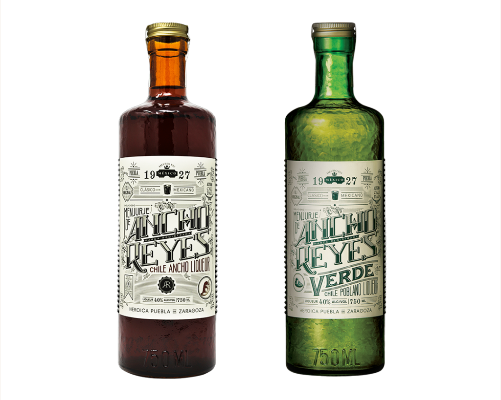
The original Ancho Reyes is based on a Poblano chile liqueur recipe from 1927, and the branding captures the boozy allure of a bygone era. While some novelty bottle shapes and colors can feel like a self-conscious attempt to elevate a mediocre spirit (with the attendant leap in price), here the fancy brown bottle instead feels like an organic extension of both the branding and the product, evoking the richness of this toasted chile liqueur. The same can be said for their more recent offering, Ancho Reyes Verde. This article covers the formulation process and the difference between the two Ancho Reyes liqueurs, or you could check out our overview of Mexican liqueurs.
(Original branding by Sociedad Anonima, a CDMX-based design firm.)
Paranubes Cafe de Olla Coffee Liqueur
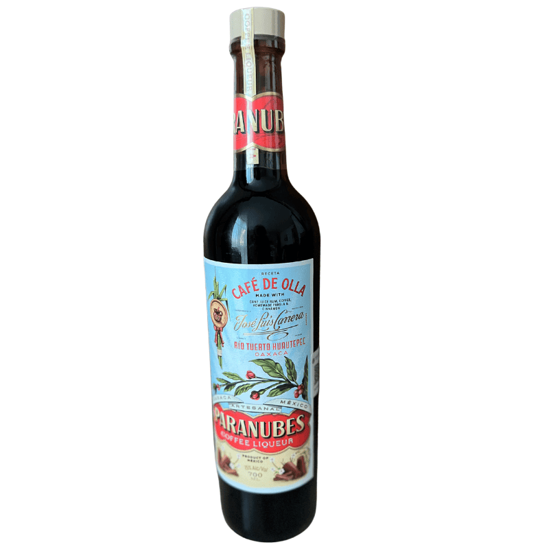
I can’t shut up about how great the Paranubes label is. Many old timey labels shy away from color, but here the sky-blue pops and the botanicals are as bright as the flavor of this spiced coffee liqueur. As with Ancho Reyes, the warm hue of the bottle evokes the spicy elixir inside. I’m not alone in my enthusiasm for this design by Abraham Lule, a Mexican graphic designer who lives in Brooklyn.
“I think it’s the coolest label I’ve ever seen,” says brand founder Judah Kuper, who worked with Lule on the redesign for Vago Mezcal. In that case, there were a lot of people in the room. For the Paranubes Café de Olla label, Kuper gave Lule free reign with his creativity.
“He is the best package designer in the world,” Kuper says. “I truly think so. He’s a great designer, and he’s an incredible typographer, which I think is overlooked when you’re talking about design. His ability to mix fonts that shouldn’t mix—people don’t realize the nuance of that type of stuff unless you’re really in the design world.”
More on the thought process behind the brand here, as well as an interview with Kami Kenna, who formulated the recipe.
Zancudo Mezcal
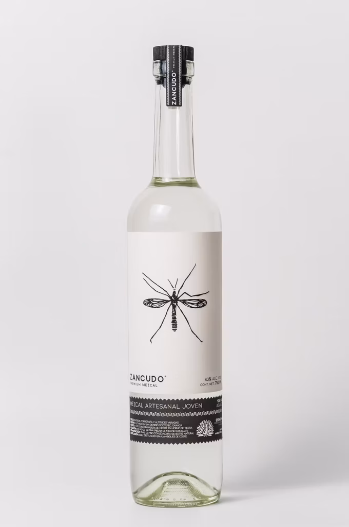
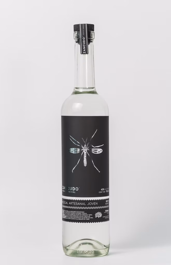
I intended this article to focus on Mexican craft spirits other than mezcal, but I discovered Zancudo at Mexico in a Bottle in San Francisco, and the logo really stuck in my mind. This mezcal from San Dionisio Ocotepec features a bold yet delicate graphic of a zancudo, or mosquito, proving that even pests can be beautiful. (Zancudo also means long-legged, which applies to the brand’s spindly emblem.) The label is notable for its stark design and for eschewing common mezcal iconography. Design by co-founder Andres Ballesteros Garza.
Note: I believe in honoring original art. I have attempted to credit the designers, although some of my queries weren’t answered. If you are reading this and worked in design on one of these uncredited projects, please contact me.
Leave a Comment